

How to Build a Consistent Video Style Across Websites and Social Media
Dive deep into our recent blog post featuring expert insights and valuable information for SaaS enthusiasts.
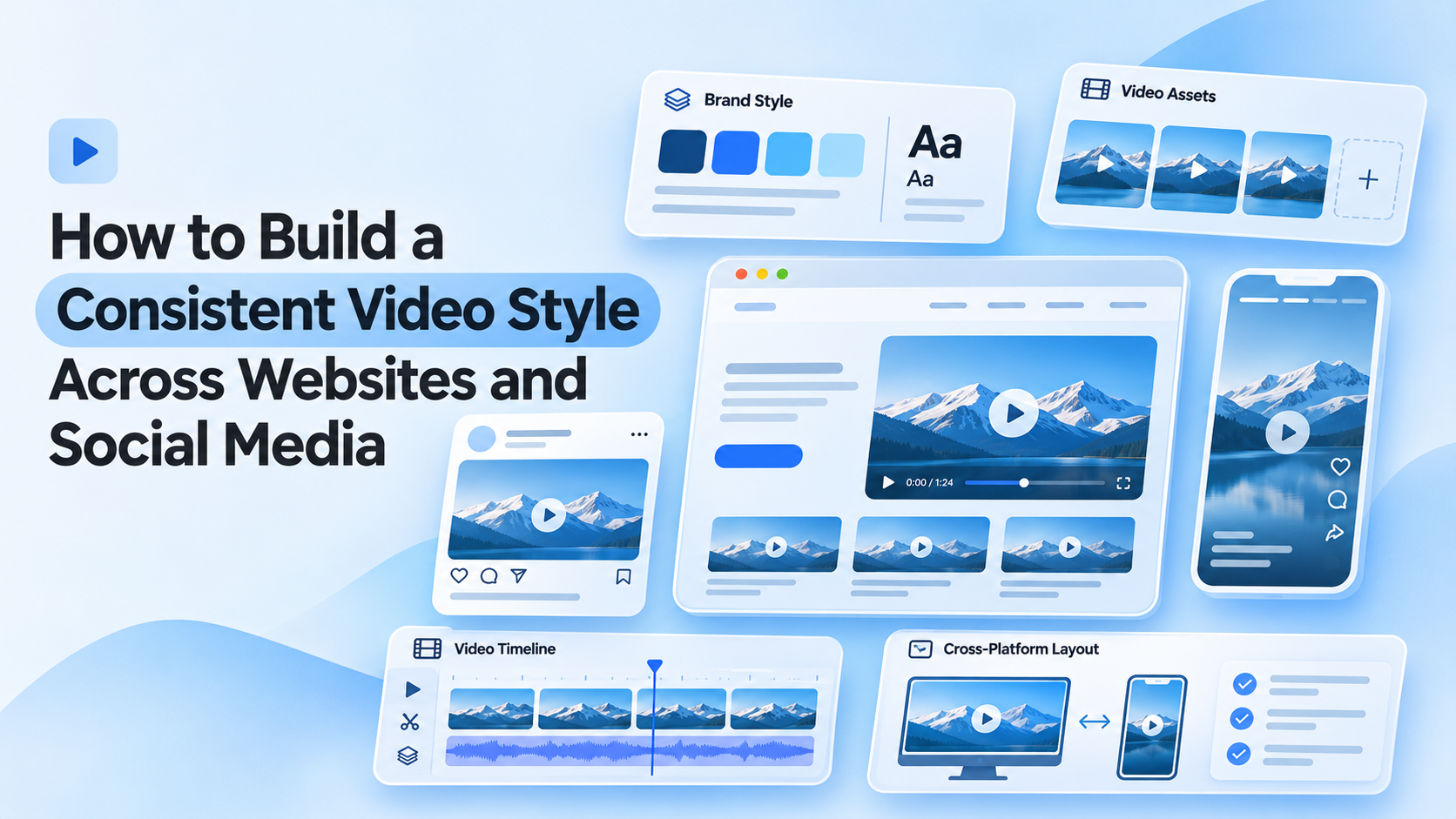
A consistent video style is a recognizable set of visual and audio choices, such as color, typography, pacing, music, and framing, that makes every video from a brand feel like it belongs together. Whether a clip appears as a hero video on a website, a short on a social feed, or a demo in an email, a viewer should sense it comes from the same place.
That sense of sameness is harder to achieve than it sounds. A website video and a social video have different jobs, different shapes, and different viewers, and they are often made by different people at different times. Without a shared style, each one drifts a little, and the brand starts to look like a collection of unrelated clips. This article looks at the elements that make up a video style, how to adapt one style across platforms, and how to keep edits consistent as the volume of video grows.
Why Consistency Matters
Consistency builds recognition. When a viewer sees a similar color treatment, caption style, and rhythm across several videos, they start to connect those videos with one brand, even before they see a logo.
It also builds trust. Videos that look and sound like they came from the same team suggest a business that is organized and pays attention to detail. A mismatched set, with different fonts, uneven audio levels, and unrelated looks, can quietly suggest the opposite.
There is a practical benefit too. A clear style makes production faster, since editors are not reinventing decisions for every video. Choices about text, color, and music are already made, which leaves more attention for the message.
The Building Blocks of a Video Style
A style is made of several smaller decisions. Defining each one makes consistency far easier to maintain.
| Element | What to define | Example decision |
|---|---|---|
| Color and look | The overall grade, contrast, and palette | A warm, slightly muted look with brand colors used for accents |
| Typography | Fonts, sizes, and placement for titles and captions | One heading font and one body font, captions placed in the lower third |
| Pacing | How quickly cuts and transitions move | Quick cuts for social, longer shots for website stories |
| Sound | Music style, voice tone, and effect use | Acoustic music at low volume, no heavy sound effects |
| Framing | How subjects and screens are composed | Subjects slightly off-center, plenty of space around product shots |
| Openings and endings | How a video starts and finishes | A short hook first, logo and call to action at the close |
| Captions | Styling and accuracy standards | Bold, readable text, with names and product terms checked |
Not every brand needs all seven spelled out in detail. Even a few clear decisions, such as a color look, one caption style, and a music direction, produce a noticeable difference.
Adapting One Style Across Platforms
Consistency does not mean every video looks identical. A website hero video and a vertical social clip serve different purposes, so some things should flex while others stay fixed.
The pattern is simple. Length, aspect ratio, and how quickly a video gets to the point change with the platform. The things that make a video recognizable, such as the color look, text style, tone, and sound, stay the same.
Websites tend to suit videos that explain, demonstrate, or tell a story, where a viewer has chosen to watch. Social feeds reward videos that earn attention quickly, since people are scrolling. A strong style lets the same brand show up in both without feeling like two different companies.
Writing the Style Down
A style that lives only in someone's head will not survive a second editor. Putting it on paper, even a single page, keeps everyone aligned. A useful video style guide usually covers:
- The color look, with a reference frame or example clips
- Fonts, text sizes, and caption placement
- Pacing guidance for each platform
- Music and sound direction, including volume expectations
- Logo and call to action placement
- A few examples of videos that match the style and a few that do not
The examples matter most. People understand a style faster by seeing it than by reading a description, and a short gallery of approved videos does more than a page of rules.
Invideo Editor: Keeping Edits on Style
Consistency often breaks down in the editing, where small choices pile up. Invideo Editor is one tool that helps keep those choices aligned. Its approach to rough cut editing starts with raw footage and a written brief, and an agent assembles a base cut that follows the structure and pace the brief describes. That gives every video a similar starting point, which is easier to bring into line with a style than a cut built from scratch each time.
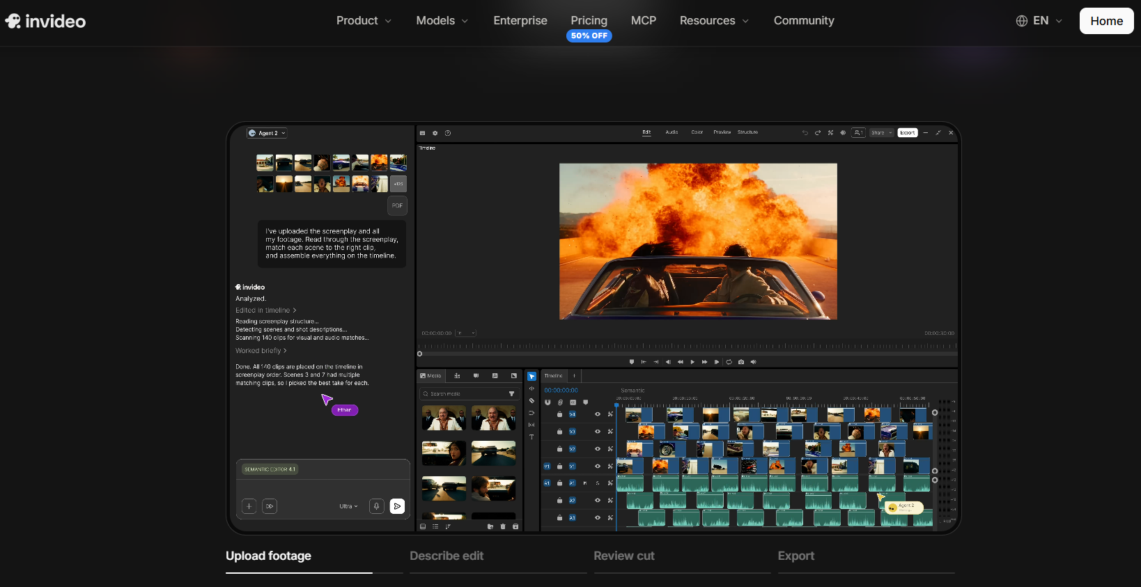
Key features:
- Base cuts built from raw footage and a plain-language brief, with pacing and structure shaped by that direction
- Requests such as a faster opening, a shorter middle, or a target duration, applied while keeping the context viewers need
- Color grading from a described look or a reference image, with manual wheels and curves for fine-tuning
- Custom LUTs that can be imported, and a grade that can be copied from one clip to others
- Platform versions, including social cuts and highlights, built from the same timeline
- Audio tools in the same project, so music and dialogue levels can be matched across videos
- Review links, so teammates can comment on a draft without exporting files
The practical value is repeatability. A brief that reflects the style guide, a reference image for the look, and a saved grade can be reused from one video to the next. The timeline stays open for manual changes, so any detail that needs a human eye can be adjusted directly. The manual timeline is free to use, while the AI agent features run on credits through paid plans.
Why Video Style Drifts
Even with a style guide, a few common patterns pull videos out of line.
Different people, different habits. When several editors or freelancers work without shared references, small differences in color, text, and pacing add up.
Platform pressure. Chasing a trend on one platform can lead to a look that does not match everything else.
Inconsistent starting points. If every video starts from a different structure, the finished videos tend to diverge, even with the same style guide.
No review step. Without a quick check against the guide before publishing, small mismatches slip through and accumulate.
Style guides that go stale. A guide written once and never revisited stops reflecting how the brand actually looks.
Keeping a Style Consistent Over Time
Consistency is an ongoing habit, not a one-time project. A short review of published videos every few months shows where drift has crept in. Keeping a small library of reusable assets, such as caption styles, title layouts, color looks, and music tracks, saves time and keeps new videos aligned. Giving one person responsibility for the final check, even informally, prevents the gradual loosening that happens when nobody owns the standard.
Final Thoughts
A consistent video style is less about rigid rules and more about a few shared decisions that every video honors. Color, text, pacing, and sound do most of the work. Once those are defined and written down, the same style can adapt to a website, a social feed, or an email without losing its identity.
The brands that manage this well tend to treat video style the way they treat a logo or a color palette: as part of the identity, worth protecting, and worth revisiting as the brand grows.
FAQ
What is the most important element of a consistent video style?
Color and text treatment are usually the most noticeable, followed by pacing and sound. Even defining these alone makes a clear difference.
Should a website video and a social video look exactly the same?
No. Length, aspect ratio, and pacing should suit each platform. The color look, typography, tone, and sound character are what stay consistent.
How do I keep videos consistent when several people edit?
Write a short style guide with examples, give editors the same references, and add a quick review step before anything is published.
Can AI editing tools help keep video on style?
They can help with repeatability. Invideo Editor, for example, can build a base cut from a brief, apply a described color look or a reference image, and create platform versions from one timeline, while leaving every change editable by hand.
How often should a video style guide be updated?
Review it whenever the brand changes in a noticeable way, and check published videos against it every few months to catch drift early.
Latest Insights
Other Insights
Dive into our blog to discover insightful articles covering a variety of topics tailored for SaaS platforms.




Design By OwlsTech Service
